China Power
China’s transformation from a developing economy into an emerging global power is likely to be the most consequential factor in twenty-first-century international politics. Its economy is now the second largest in the world, millions of Chinese citizens have been lifted out of poverty, and the People’s Liberation Army is quickly modernizing. In just a few decades, China has moved from the periphery to the center of the international system.
Yet despite numerous advances, China’s rise is not complete and its capabilities remain uneven. By some standards China is a developed country, yet in other ways it is still developing. Moreover, the nature of Chinese power is poorly understood. These unknowns result in misrepresentations of China’s position within the international community, which contributes to the uncertainty over the implications of China’s rise. ChinaPower addresses this problem by providing our users with the necessary tools to compare Chinese power with that of other countries.
Power as a concept is nebulous. Therefore, ChinaPower offers a clear statement of how we conceptualize power throughout the website. In broad terms, ChinaPower examines five interrelated categories of Chinese power: military, economic, technological, social, and international image. Since Chinese power cannot be evaluated in a vacuum, each element of power is compared with other relevant countries.
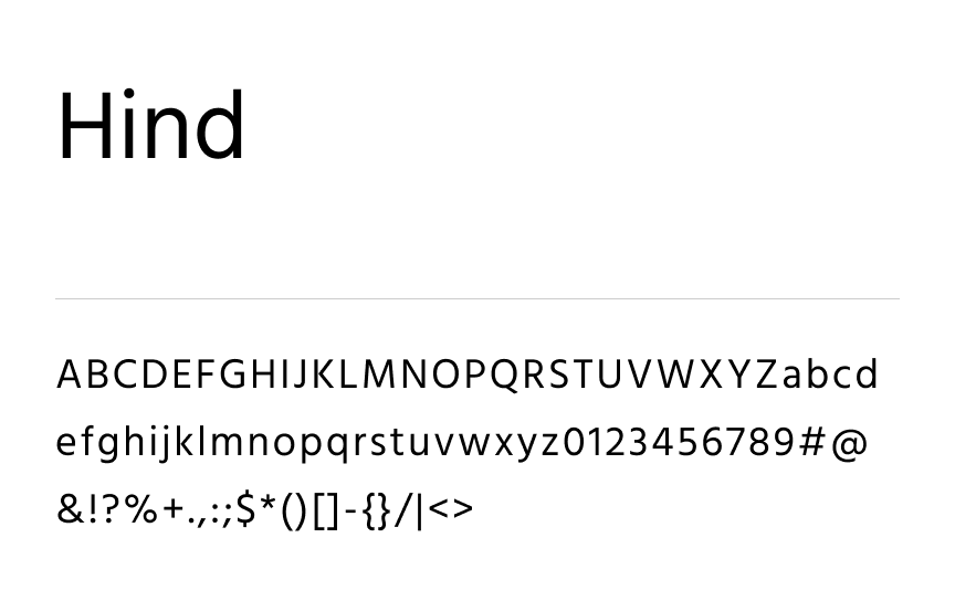
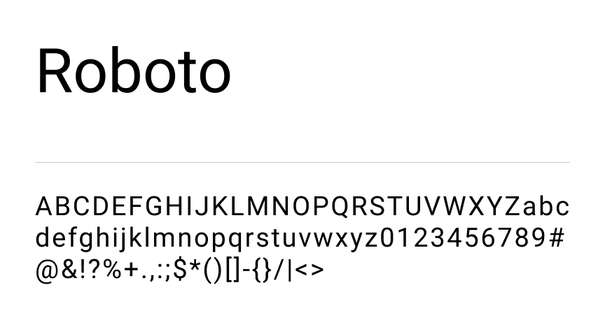
Typography
Overview of pairings

Hind

Roboto
